Moms Demand Action for Gun Sense in America Campaign
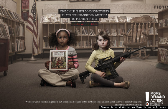
Guiding Question: How does the author convince the reader that guns shouldn't be legal?
Thesis Statement: The author uses a variety of visual and textual techniques to convince the reader that it is illogical for guns to be legal.
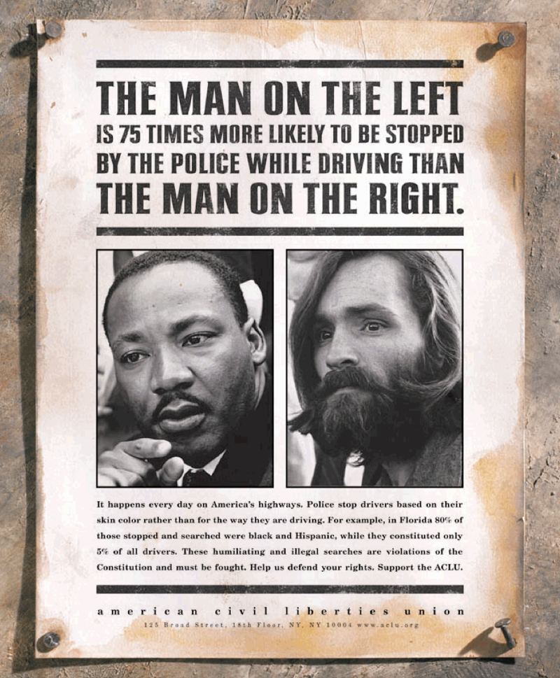
American Civil Rights Liberties Union Anti-Discrimination Campaign
https://docs.google.com/document/d/1oamJqnqeWf2-S6nV97lIhpFPKQjZRC-GsD9JZ2d8YnU/edit?usp=sharing
Guiding question: In what ways does this ad for the American Civil Liberties Union use visual and written language to spread awareness about racial inequality?
Thesis Statement: The author successfully uses compositional styles to guide the viewer's interpretation and understanding while factual arguments and rhetorical techniques are used to highlight the problem of discrimination and motivate the viewer to stand up against it.
Planning
- The advertisement targets an American audience, and aims to motivate people to stand up against discrimination by supporting their organization.
- They use famous examples of people who went against prejudiced expectations.
- They then use text to contrast these examples with statistics and facts in order to appeal to logos.
- A traditional wanted poster style is used for the advertisement, which many people associate with the wild west and crime, fitting the theme of the advertisement which is that of improper jurisdiction and law enforcement.
- The images are placed in the center of the advertisement, and take up a large amount of space, meaning they are the first thing the viewer focuses on.
- The images lack saturation, making them appear as if they were historical photographs, as they are in gray scale. This allows the viewer to easily associate the pictures with the important figures they represent.
- The easy association means that the audience associates the people with their respectively virtuous and harmful actions.
- However, the large text in bold, which the reader's eyes move on next, juxtaposes what the audience has in mind about the pictures.
- The text uses statistics when it states that "the man on the left is 75 times more likely to be stopped by the police than the man on the right", appealing to logos. The use of the large number of 75 and times amplifies the huge disparity that is present, as people are rarely used to seeing so many multiples in statistics, with 2 or 3 times being more common.
- The seriousness of this statement is emphasized through the use of capitalized, boxy text, which exudes confidence. Fully capitalized letters are often used to indicate shouting, which in this case resembles a loud tone of voice, which in this case would be one from a source of authority, such as an announcement. Square shapes often indicate strength and stability, which reinforces the idea of confidence which the text exudes.
- The use of "man" instead of more specific terms such as the MLK and Mason's names, allows the reader to expand their focus from the two specific examples to their more general differences.
- The text causes the viewer to reconsider the image, as it directly references both photos as "the man on the left" and "the man on the right". This reanalysis leads the audience to uncover a new perspective on these photos that builds off of their previous notions.
- The image is cropped very close to the faces of the two men. As other factors which could be used to associate things about background and personality such as clothes and background objects aren't visible in the photo, the race is what the audience shifts their focus to.
- This allows the text and image to connect with the message. Despite the great accomplishments of Black and Hispanic communities, and the many horrible things people from white communities have done, such as the serial killings of Mason, many still fail to see that individuals are far more varied and important than the race or ethnic group they represent.
- After intriguing the viewer with the headline that instigates strong emotions when connected with the two portraits, the audience searches for more information and then move on to reading the smaller text below the images, which grabs less attention than the pictures and headlines and thus serves an auxiliary role, providing information and further reinforcing the intended feelings and ideas the advertisement aims to elicit within the viewer.
- Direct address, "Help us defend your rights", makes the reader feel more responsible and personal about the discrimination.
- Discrimination is referred to as "violation of the constitution", which emphasizes the problem as the constitution is something held in high regard by many Americans and a breach of rules of the constitution is something to be concerned about.
Paper 1
This advertisement from the American Civil Liberties Union published in 2000 aims to highlight the discrimination present by authorities, predominantly against black and Hispanic people in the United States. The target audience of this advertisement is not very specific and appeals to almost all Americans able to understand the concepts of racism and familiar with historical discrimination of marginalized communities. The aim of the advertisement is to motivate viewers to stand up against bias and to donate to the ACLU. The advertisement focuses on how differently police forces treat people based only on their skin color, and aims to inform the audience about how notions about race and ethnicity lead to harmful and often false expectations about others and can even lead to warping of perception in order to reinforce one's own, baseless ideas. The advertisement tackles a very contentious topic, and thus choices are carefully made to best convince the reader of the author's perspective. The author successfully uses compositional styles to guide the viewer's focus and understanding while factual arguments and rhetorical techniques are used to highlight the problem of discrimination and motivate the viewer to stand up against it. Understanding of human thinking and clever usage of composition can already be seen by one of the most central aspects, which is the two pictures in the center of the advertisement.
People almost always prefer pictures over text, as our brain is far quicker at interpreting them and they are generally more attention-grabbing. The visual aspects thus are what first grab the viewer's attention. In this advertisement, pictures are used very specifically to garner interest and understanding before the audience even reads the text, setting a firm contextual foundation which emphasizes the impact of the arguments later presented in the text. The general aesthetics of the poster are the most noticeable at a glance. A traditional wanted poster style is used for the advertisement, which many people associate with the Wild West and crime. The Wild West is often associated with lawlessness and disorder, setting the theme of improper jurisdiction and law enforcement. The two photographs which are placed in the center of the advertisement and take up a large amount of space, are what the viewer focuses on next, after getting a brief understanding of the theme through a glance at the layout and style of the poster. These images lack saturation, making them appear as if they were antique photographs, as they are in grayscale. This allows the viewer to easily associate the pictures with the important figures they represent, as the photos elicit a sense of historical significance. The easy association means that the audience associates Martin Luther King and Mason with their respectively virtuous and harmful actions. The photographs are curated to remove distractions. Both people are facing similar angles, and are under similar lighting. Little can be seen of their clothes and the background has been cropped to be indiscernible. Additionally both are completely lacking in saturation, meaning they share the same grayscale color palette. Many of the traits that could have separated the mood between these two photographs are intentionally kept the same between the two. This means that the key features used to discern differences between the pictures are the looks of the people, one of the defining characteristics of which happens to be race and skin color. These pictures help set expectations for the audience and set the groundwork for the impactful message of the headline, which is what the reader’s focus moves on to next.
After interpreting the images, the audience will move on to text. The most attention-grabbing text in the advertisement is the bolded headline. This headline aims to hook the reader and ensure that their attention is secured long enough so that they also read the smaller text which provides essential information. The first thing that is used to intrigue the viewer is the font choice. The statement has thick, fully capitalized letters in a blocky font. Fully capitalized letters are often used to indicate shouting, which in this case resembles a loud tone of voice, such as what would be used during an announcement or speech to large crowd. Combined with square shapes of the letters which often indicate strength and stability, the font choice manages to instil a sense of confidence and authority coming from the advertisement. This authority adds to the content of the text, which is an argument based on a statistical number. The authority bolsters the credibility of the claim and makes it more believable to the reader. The content itself is engineered to be shocking and aims to intrigue the viewer into reading more. The text uses statistics when it states that "the man on the left is 75 times more likely to be stopped by the police than the man on the right", appealing to logos. The use of the large number of 75 and “times” amplifies the huge disparity that is present, as people are rarely used to seeing so many multiples in statistics, with 2 or 3 times being more common. Additionally, this contrasts previous notions held by the viewer, where Martin Luther King was viewed as upstanding and virtuous while Mason was understood to be cruel and criminal. Why would someone be stopped for interrogation when they are defined by their actions to be a righteous person? The use of the simplistic term "man" instead of more specific terms such as the Martin Luther King’s and Mason's names, reflects this issue and allows the reader to connect the two examples to the generalized problem of how people are judged and prosecuted based on their race rather than their actions. Understanding this connection builds intrigue in the viewer, and the confidently provided, yet outlandish statement about rates at which people are stopped by police while driving hooks the reader and interests them enough into reading the rest of the text, which provides the most essential details.
The smaller text under the two pictures is less noticeable at a glance, and intentionally so, as it is meant to be read last, after the reader has gained an generalized understanding of the problem and developed the curiosity to learn more about it. This section further reinforces the statement in the headline with more discrete data, and provides a call to action. In the first sentence, the article restates the issue, so that it is now firmly understood by the reader in literary form, as it is possible the problem was understood in a more abstract way before. Then an example is given, “in Florida 80% of those stopped and searched were black and Hispanic, while they constituted only 5% of all drivers”. While the example provides a similar point to that of the headline, providing new statistics on the issue further appeals to logos. Searches are described as “humiliating” and “illegal”, which evokes feelings of anger in the reader at the unfair standard these drivers are being held to, simply due to their physical appearance. These baseless searches are described as “violations of the Constitution”. The Constitution is held in high regard by many Americans, and a disregard for its rules is something taken seriously by many. Mentioning that this issue “must be fought” makes the reader feel as if the problem isn’t being addressed properly and that additional support is needed. This notion is supplemented by the following sentences, which finally state the call to action. “Help us defend your rights” makes the reader feel that their own rights are under threat and need protection, further reinforcing the sense that action must be taken. Only after the viewer has gained compassion and concern for the issue through contrast of races and their treatment, statistical and factual evidence does the ACLU ask the user for support. This ensures that they are only requesting something from the reader, which could be seen negatively, after persuading the reader of their arguments and reasoning.
In conclusion, the ACLU manages to successfully use composition techniques through clever choice of images and aesthetics in order to guide the reader’s focus while using factual and statistical evidence built off of the groundwork provided by the visual layout in order to convince the reader to join in on the ACLU’s call of action. The advertisement aims to tackle a difficult issue, and one that is often hard to recognize today, as it is often disregarded as something left in the past and otherwise so ingrained in our consciousness that we fail to notice it. Prejudice and discrimination, of varying levels, is one of the most pressing social issues plaguing our planet. Especially in the United States, where this advertisement from 2000 has not lost its relevance in the slightest. The ACLU, aims to motivate the reader to support their cause in trying to educate people about discrimination and fight against it. This advertisement, with persuasive aims laid aside, goes to show that despite the great accomplishments of Black and Hispanic communities, and the many horrible things people from white communities have done, such as the serial killings of Mason, many still fail to see that individuals are far more varied and important than the race or ethnic group they represent, and forgo these stark examples if they aren’t in line with their own personal narrative.
Document Versions
My Paper 1
https://docs.google.com/document/d/146bsYwGsAzDF3W4gG5hzD-4Ujz32J5_x3kCRxEhrbD4/edit?usp=sharing
Student Response Analysis
https://docs.google.com/document/d/1cbmdNPnb-E3o7SRZmSx01GEKP26p57lir-vjjL_4yWk/edit?usp=sharing